
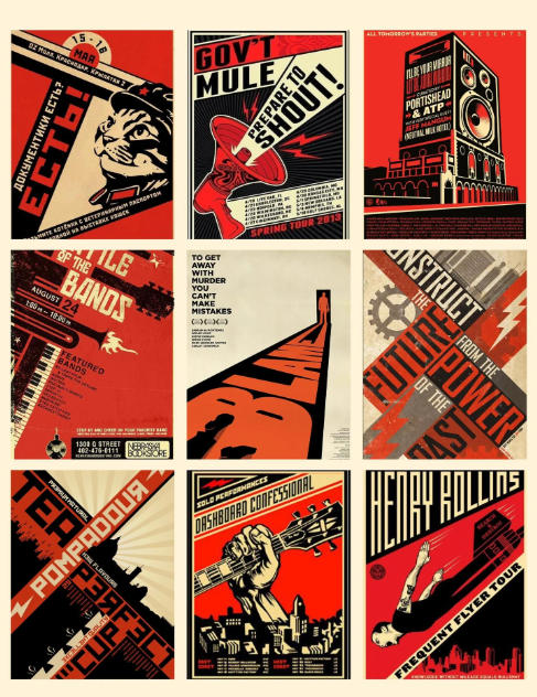
Posters are widely used in our daily lives. We often see different posters in business offices, mobile phone stores, and movie theaters. Poster printing is actually very simple. However, it’s often the simplest things that can lead to problems. The quality of poster printing depends not only on the poster designer but also on the printer’s lack of attention to detail, which can ultimately lead to subpar results. Below, we will explain some essential tips for poster printing and their applications:
I. Introduction to Poster Printing Considerations:
1. Ink Thickness and Ink Volume Balance. In poster printing, ink color is primarily controlled by controlling ink thickness. Ink color and ink balance are closely related. Properly controlling the ink balance and the pH value of the dampening solution is crucial.
2. Printing Pressure. Printing pressure significantly affects the degree of ink transfer from the printing plate to the paper. Adjusting the printing pressure within the appropriate range produces thick ink layers and clear images.
3. Printing Speed. To ensure sufficient contact between the printing surfaces and improve print quality, controlling the printing speed and maintaining a stable ink layer thickness is crucial for producing high-quality prints.
4. Dry density difference during proofing. Measure the density of each color just printed. During printing, refer to these density values to ensure the ink colors are nearly identical. A densitometer with a polarizing filter can eliminate light reflected from the ink surface. The measured wet density is very close to the dry density, and the measured density value is minimally affected by the wetness or dryness of the ink layer.
The above points are some essential knowledge for technicians when printing posters. Poster printing is simple. Master these points and you won’t have to worry about producing excellent prints.
II. Purpose of Poster Printing:
Poster printing is a reproducible and disseminable visual communication medium, using graphic design, text, and other graphic elements to convey information, including business culture. Text design is crucial in poster printing, as fonts are a key component that directly conveys the poster’s message. The font should align with the poster’s theme and intended content. The purpose of font design in poster printing is to accurately convey information to the viewer in a visually appealing manner.
The most interesting and challenging aspect of poster design is how designers can utilize static elements to create imaginative works that accurately convey the theme. By employing color, texture, virtual reality, and three-dimensional techniques, color contrast, line virtuality, and the thickness of text blocks can convey perspective, space, speed, and scent absent from a flat surface. The combination of text and graphics allows viewers to experience a richer emotional rhythm. Through the contrast of different colors and patterns, text, in addition to its inherent connotations, becomes more like a character wearing different clothes and possessing different personalities, engaging the viewer with directness, elegance, impatience, and composure. This type of visual design, which uses text as an image and scene, is often used in storytelling and thematic posters.
In this era of understated poster printing, the playfulness of text in posters is crucial for effectively conveying information. Besides ensuring accurate display and clear reading of text, engaging and well-designed text is a powerful guarantee of reader engagement. Character graphic design is not only about typeface design and graphic design, but also about the creative expression of the poster’s theme.